
DJ Neil Armstrong
“All Out King” Series
Creative Direction, Design, Illustration
The phrase “All Out King” derives a quote from a movie called Style Wars...
“lf you specialize in one thing, you really can't call yourself an all-out king.”
This quote was the inspiration for this mixtape series. To showcase his love for all types of music, he created the A.O.K. series with different musical themes.


“Haena created the visual look for my mixtape series called “All Out King.” Haena’s task was to make a different cover to represent each mixtape and theme, but since it was a series, each cover still had to have a relationship to the other 5, and also have an aesthetic that represented the “DJ Neil Armstrong” brand as a whole. Her job was to join the art, commerce and passion that I was expressing through music visually.
These mixtapes started coming out over 10 years ago but are still some of people’s favorites and my most recognized project. Haena’s designs made sure that they would be remembered. Her album art helped make the work that I did a classic, standing the test of time.”
View more projects:


April 2012 interview on Hypebeast
What is the meaning of the crest and why did you make it to represent the series?
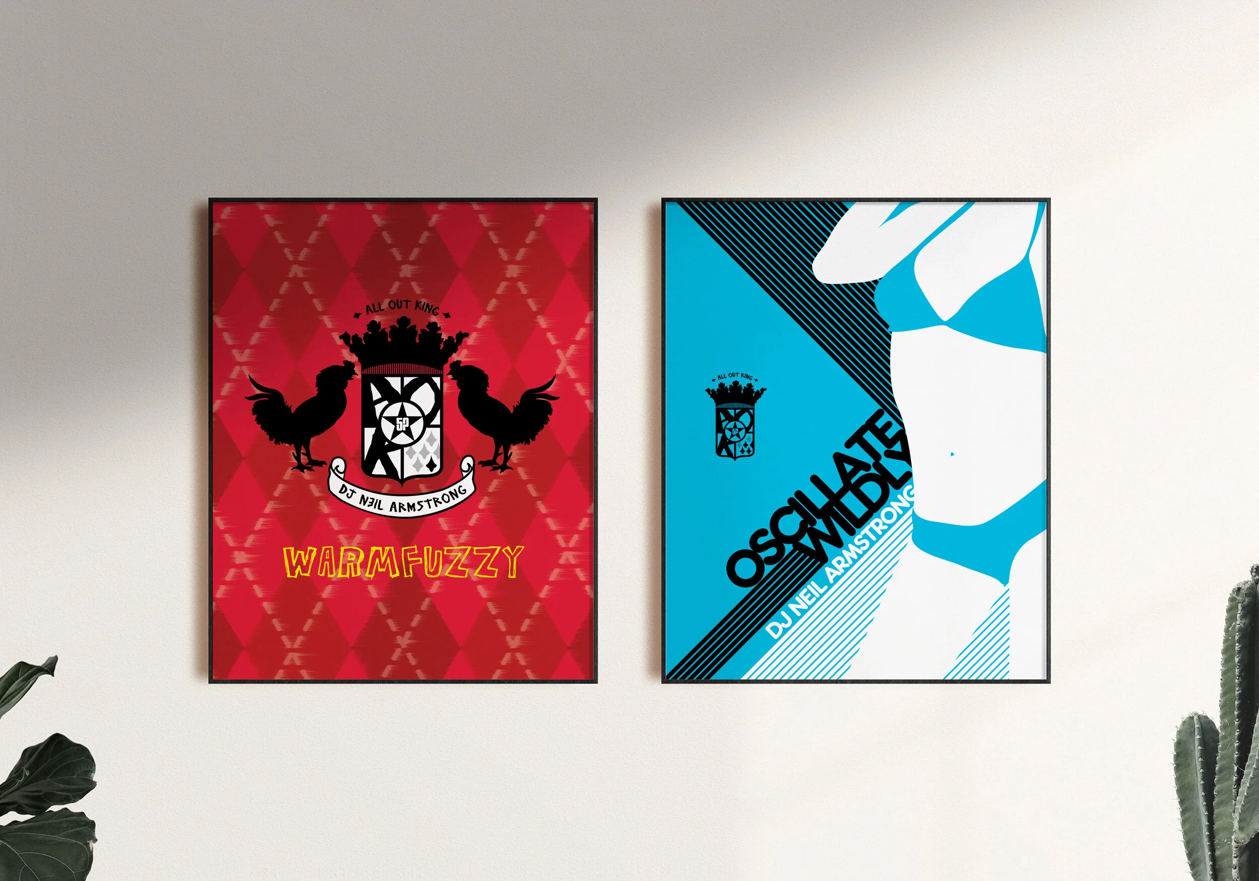
Haena: When Neil first told me about the A.O.K. series, and what it was for, the first thought that popped into my head was, “I gotta create a crest to represent the series.” I felt like the six mixtapes he was gonna put out was like…a new family. Each mixtape was the equivalent of a different family member and all fell under one roof. What better way was there to represent that philosophy other than a family crest? It just felt right to me. In addition to that, I incorporated the roosters as the defining family “animal” because using a lion would have been too predictable and roosters are also known as “kings.” Using them gave the crest that extra sumthin-sumthin it needed to seal the deal.
What inspired the Warmfuzzy cover?
Haena: When I design for anything music related, I usually listen to the music a bunch of times and then take note on the emotional impact it has on me. How does it make me feel? What message did I get from it? What does it project? It was questions like that, that guided how I went about designing the first “All Out King” mixtape to kick-off the series.
The first mixtape Neil put out was “Warmfuzzy,” and his plan was to release it in time for Valentine's Day 2005. There are a lot ways designs can become superrrr cheesy when it revolves around Valentine's Day, so I made sure to stay away from being overly literal (like hearts and cherubs – barf) and followed my intuition. When I listened to it, it made me wanna jump under the covers or sit by a fireplace, hahaha. I couldn't get the thought of soft, warm, argyle socks out of my head and that pretty much set the tone for “Warmfuzzy.” Since this was the first one, I decided to feature the family crest and the roosters and keep the messaging simple…it was my way of visually introducing the “All Out King” family to Neil's audience. By doing that, it allowed me to approach the rest of the series' artwork differently and uniquely cater to each soundscape.
What inspired the cover for the 2nd album, Extraordinary?
Haena: When Neil first told me the theme for “Extraordinary,” I immediately started brainstorming on how I could tie in the album's them without straying too much from Neil's identity. Then when he shared what he was working on, the creative direction I needed to take was clear to me...I needed to tie in his old artwork, his baby photos, and what he was doing now – except with a spin.
I began working on illustrating a little boy that could be mistaken for him. I wanted a kid with the attitude and spunk his childhood photos had; without hesitation, I started working on a guitar for the kid to play. The pieces just fell into place from that point on. From the sash that's hung loosely around his hips, to the wing elements flanking the title, to the roosters on the guitar, to the velcro strap sneakers...all the little details unified the message I was trying to portray...that this was a “rock” influenced mixtape but with Neil's stylistic flair. Sort of like the grown-up alternate version of what his other mixtape album art had.
What inspired the cover for the 3rd album, Filthy?
Haena: Filthy. The first time I heard it, it only confirmed what I already had in mind for the artwork. Integrating a little boy into the design didn't feel right to me. Due to the title and the content of the mixtape, I explored a lot of different ideas before finalizing the concept. To me, the music felt older, more raw, and kinda gritty...to maintain the masculine undertones the album had, I decided to illustrate an "ominous" looking photo of Neil, keep it in grayscale, and allow the title to speak for itself. For the title treatment, I wanted it to look scratchy and for a lack of a better word, dirty. I wanted it to look unpolished and gritty to fit the theme of the mixtape.
What inspired the cover for the 4th album, Oscillate Wildly?
Haena: When I first heard “Oscillate Wildly,” two things came to mind. The color blue and Miami Vice – the whole vibe of the mixtape was cheeky and fun. I couldn't get the thought of a late 80's/early 90's beach party out of my head, so I took that theme and ran with it. I knew I wanted a bikini-clad woman but it wasn't with the purpose of having it scream T&A – which is why the woman isn't super busty and wearing a G-string. I wanted the design to allude to an era more than anything else. Having the woman posing the way she is, captures the cheekiness and campiness I wanted to evoke. I added in the stripes and rounded typeface to keep things feeling light and fun.
What inspired the cover for the 5th album, Music For When Nobody's Looking?
Haena: I have to admit, I had the most fun designing this album. Don't get me wrong, I loved concepting and designing for the others, but this one struck a chord within me.
When I heard the mixtape, it was exactly what the album title said – music for when nobody's looking. Music you never, ever, wanted to admit that you listened to, yet knew all the words to by heart. Everyone I know who listened to it for the first time, all took a trip down memory lane and were embarrassed (or completely unabashed) to say they knew every single song.
At first, I had no idea how I was going to portray the theme but after some brainstorming, the idea came and it was a done deal. I began to illustrate a little boy listening to music on his headphones and on the “look-out” for passerby and in the end, it fit the emotion I wanted to convey. What I wanted was to capture the innocence and child-like wonder we all had in our youth, but most all, I wanted to embody the mischievousness that came with being sneaky. After all, the fun was in the secret, right?
What inspired the cover for the 6th and last album, Original All Out King?
Haena: The “Original All Out King” is the only album that I had a clear idea on what I wanted to do from the get-go. I knew I either wanted to create a trophy, or a medallion, to signify the completion. The only thing that wasn't clear was whether or not to incorporate a little boy – which I tried but found that adding a boy muddled things so I opted not to.
I went through tons of revisions…at first, I went through different trophy styles, then various medallion styles, and in the end, I came up with a medallion that solidified my vision. I found that using a trophy convoluted the message too much. The medallion was more refined in it's simplicity, as well as graphically compelling. It conveyed the album's theme to a tee, and brought the series to a close, in a graceful and grandiose way. In my head, wrapping up the “All Out King” series was kinda like achieving something on an Olympian scale…in the mixtape world that is.
Musically, Neil set out to prove that he was well-versed and adept in all genres of music, and he did exactly that with the “All Out King series.” For me, it was a design journey that allowed me to not only collaborate with soundscapes, but also stretch and challenge my creativity in a new way. Collaborating with Neil on this project was, and still is, one of my all-time favorite projects to date. I absolutely cherished working on it and hope Neil's fans felt the love I felt, while I was designing the album artwork.